Tuesday, December 23, 2008

Tutorial 6

The Final Image
1. Create the effect of tree bark using filter > distrot.
2. Lighting effects are used to create that kind of light source is shining from the top.


3. The M curve is created to get the chrome effect.


4. I imported an image that I downloaded from google


5. Feather the sides and add motion blur the the 70's logo.


Monday, December 22, 2008

Assignment 2 the process

Ta daaa.....
(wait for the animation to kick in)

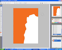
1. Create a background with some kind of orange paint.


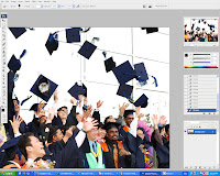
2. I open an image that I shot during mmu convo 2008


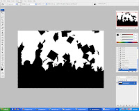
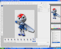
3. Magic wand the white areas and delete it. after that use the paintbrush to paint the whole picture black to get the silloutte effect.


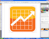
4. This button was created in illustrator. The graph is to symbolize Financial engineering.


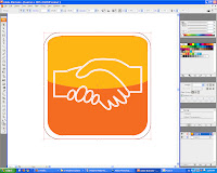
5. This button was created in illustrator. Shaking of hand are management.


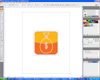
6. This button was created in illustrator. Bag of money is equal to finance.


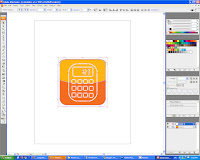
7. This button was created in illustrator. Calculators are unsperatable with accountants.


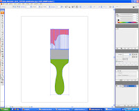
8. This brush was created in illustrator. Brush is to put in the wall paper to have that painting look.


9. Imported the e-bee to create the animation effect.


10. Now to create animation for the 4 buttons on the left. Animation was learn by watching a youtube video. From there I learned to create the glowing e-bee, and the 4 icons at the left.


Thursday, December 18, 2008

Tutorial 5


This tutorial thought me 3 more different techniques:Layer Style effects ( I used this before in assignment 1)the use of advanced Blending Effect Techni
ques
  • Blend two images together using the Layers styles blending options
  • techniques of applying brush stroke with effects
  • curve effects techniques
After creating the flames then its to colour it following the tutorial I slide the contrast and to adjust the colour intensity. 

2. Liquidfy the flames with the swirl tool so that the flames looks like bending.


3. Finally I add a filter stylize the background to CHROME to get the silver sort of like metal like effect and added the lightnings to kind of spark the flames on his hand.


Final Image : 


Tuesday, December 16, 2008

Monday, December 15, 2008

Project Charter Assignment 2

Project Charter Assignment 2

Assignment Title: Digital Wallpaper

Project Start Date: 8 December, 2008

Project Finish Date: 23 December, 2008.

Project Manager: Ng Hsien Ming

Email: hsi3nming@gmail.com

Website: mcg1014-1061103254.blogspot.com


------------------------------------------------------------------------------------
Project Objective

A learning process of implementing the multiple tools that are available in Adobe Photoshop CS3 in creating a digital wallpaper for MMU FOM Open Day. In this wallpaper, I will be promoting the faculty of Management to the public and provide them with knowledge about benefits of joining FOM and making the smart choice.


Approach

I’m creating digital wallpaper based on the pictures that I have taken via websites and some of my snapshots using the digital camera. I will also be using Adobe Illustrator to make vector graphics which I will be adding in later on.The wallpaper will be in A4 size.

I will promote my faculty which is Management faculty to the public by inserting the FOM signboard to clarify the FOM main theme. Then, some images like FOM building, FOM students.

In Photoshop, I’m using the layering techniques to rearrange and do some edit part to the images.Other tools such as marquee and lasso tool will be used. Filter tools also such as Gaussian Blur, Drop Shadow and the adjustment of the colours (Hue, Saturation, and Contrast) are also being used. Thus, applying the layer mask, crop, lasso tool, shape tool, and etc will make the effect of the wallpaper to be nicer. The insertion of text, will make an impact towards the audience when they read it.

The idea of my digital wallpaper is tmainly of course to promote the faculty. Then, I will put some FOM signs to it for the clearer understanding, plus the addition of the text with some thought in it. I’m also will include graduated students with some kind of silloutte effect created in photoshop.


Roles and Responsibilities

1st Phase: Idea is sketched and images are snap and searching through website
2nd Phase: Images are edited and place inside the wallpaper. Text will be included
3rd Phase: Consult with Mdm Lydia
4th Phase: Final touches are made
5th Phase: Submission of Assignment 2


Comment

Assignment 2 is really though because the idea and concept that needs to be thought of is very tidious and with midterms near the submission date it is very difficult to concentrate. All thanks to the tutor who brought the date forward instead of submitting at 3 january 2009. Everything seems to be in rush.

Wednesday, December 10, 2008

Tutorial 4

This tutorial teaches about how to create liquid text.

1. First I Chose Gradient Overlay to begin and chose colors in the Gradient Editor & adjust the gradient angle.

2. After that I drag layer into Styles Palette & name it. Click style & apply it to another selected layer duplicate, blur & adjust levels of Green Channel, define as pattern & use it as a texture. Then I used the paint brush to achieve the effect below. Before that I have also created another layer and edited it with plastic wrap wo give it a more wrappy look.


3. Lastly I changed the colour balance and I get the brown effect.


4 . The final image

Tuesday, December 2, 2008

Tutorial 3

1. I started of with the original layer then I duplicated the layer and then created a new blank layer. I used the lasso tool, move, and clone stamp tool to get this effect. Oh and feather the lasso selection to so that the edges is not so rough.


2. Now to insert text and create a new alpha channel in the channels tab. Well i created lines with 2px - 8px use the pixelated and gaussian blue effect to get this.


3. Then I use the magic wand to select all the alphabets and then create a new channel 'alpha 2' and this time change the alphabets stoke to 10px and filter it with brush strokes and this is the effect.

4. I also changed the blending option of the layer and thus get this effect as if the words are coming out from the cracked wall.


5. Finally the text below is also done with the same technique as the above. Then I split the canvas to half and transform half into black and white. Changing the american dollar to 100 Euro.


6. The final image jeng jeng jeng...