Tuesday, December 23, 2008
Monday, December 22, 2008
Assignment 2 the process
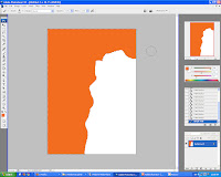
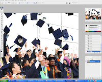
2. I open an image that I shot during mmu convo 2008
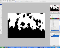
3. Magic wand the white areas and delete it. after that use the paintbrush to paint the whole picture black to get the silloutte effect.
4. This button was created in illustrator. The graph is to symbolize Financial engineering.
5. This button was created in illustrator. Shaking of hand are management.
6. This button was created in illustrator. Bag of money is equal to finance.
7. This button was created in illustrator. Calculators are unsperatable with accountants.
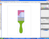
8. This brush was created in illustrator. Brush is to put in the wall paper to have that painting look.
9. Imported the e-bee to create the animation effect.
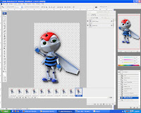
10. Now to create animation for the 4 buttons on the left. Animation was learn by watching a youtube video. From there I learned to create the glowing e-bee, and the 4 icons at the left.

Thursday, December 18, 2008
Tutorial 5
- Blend two images together using the Layers styles blending options
- techniques of applying brush stroke with effects
- curve effects techniques


 After creating the flames then its to colour it following the tutorial I slide the contrast and to adjust the colour intensity.
 3. Finally I add a filter stylize the background to CHROME to get the silver sort of like metal like effect and added the lightnings to kind of spark the flames on his hand.

Tuesday, December 16, 2008
Monday, December 15, 2008
Project Charter Assignment 2
Assignment Title: Digital Wallpaper
Project Start Date: 8 December, 2008
Project Finish Date: 23 December, 2008.
Project Manager: Ng Hsien Ming
Email: hsi3nming@gmail.com
Website: mcg1014-1061103254.blogspot.com
------------------------------------------------------------------------------------
Project Objective
A learning process of implementing the multiple tools that are available in Adobe Photoshop CS3 in creating a digital wallpaper for MMU FOM Open Day. In this wallpaper, I will be promoting the faculty of Management to the public and provide them with knowledge about benefits of joining FOM and making the smart choice.
Approach
I’m creating digital wallpaper based on the pictures that I have taken via websites and some of my snapshots using the digital camera. I will also be using Adobe Illustrator to make vector graphics which I will be adding in later on.The wallpaper will be in A4 size.
I will promote my faculty which is Management faculty to the public by inserting the FOM signboard to clarify the FOM main theme. Then, some images like FOM building, FOM students.
In Photoshop, I’m using the layering techniques to rearrange and do some edit part to the images.Other tools such as marquee and lasso tool will be used. Filter tools also such as Gaussian Blur, Drop Shadow and the adjustment of the colours (Hue, Saturation, and Contrast) are also being used. Thus, applying the layer mask, crop, lasso tool, shape tool, and etc will make the effect of the wallpaper to be nicer. The insertion of text, will make an impact towards the audience when they read it.
The idea of my digital wallpaper is tmainly of course to promote the faculty. Then, I will put some FOM signs to it for the clearer understanding, plus the addition of the text with some thought in it. I’m also will include graduated students with some kind of silloutte effect created in photoshop.
Roles and Responsibilities
1st Phase: Idea is sketched and images are snap and searching through website
2nd Phase: Images are edited and place inside the wallpaper. Text will be included
3rd Phase: Consult with Mdm Lydia
4th Phase: Final touches are made
5th Phase: Submission of Assignment 2
Comment
Assignment 2 is really though because the idea and concept that needs to be thought of is very tidious and with midterms near the submission date it is very difficult to concentrate. All thanks to the tutor who brought the date forward instead of submitting at 3 january 2009. Everything seems to be in rush.
Wednesday, December 10, 2008
Tutorial 4
1. First I Chose Gradient Overlay to begin and chose colors in the Gradient Editor & adjust the gradient angle.

2. After that I drag layer into Styles Palette & name it. Click style & apply it to another selected layer duplicate, blur & adjust levels of Green Channel, define as pattern & use it as a texture. Then I used the paint brush to achieve the effect below. Before that I have also created another layer and edited it with plastic wrap wo give it a more wrappy look.

3. Lastly I changed the colour balance and I get the brown effect.

4 . The final image

Tuesday, December 2, 2008
Tutorial 3

2. Now to insert text and create a new alpha channel in the channels tab. Well i created lines with 2px - 8px use the pixelated and gaussian blue effect to get this.

3. Then I use the magic wand to select all the alphabets and then create a new channel 'alpha 2' and this time change the alphabets stoke to 10px and filter it with brush strokes and this is the effect.
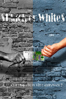
 4. I also changed the blending option of the layer and thus get this effect as if the words are coming out from the cracked wall.
5. Finally the text below is also done with the same technique as the above. Then I split the canvas to half and transform half into black and white. Changing the american dollar to 100 Euro.

6. The final image jeng jeng jeng...
Tuesday, November 25, 2008
Project Charter
Assignment 1 Title: Printout Postcard for the theme “
Project Start Date: 20 November, 2008
Project Finish Date: 28 November, 2008.
Project Manager: NG HSIEN MING
HP: 012-3237804
Email: hsi3nming@gmail.com
Website: http://mcg1014-1061103254.blogspot.com/
Project Objective: Students are to create a multi-cultural event for a post card. The theme would be “
Approach: Write down how you create the postcard?
I created the postcard using Adobe Photoshop CS3
Using what images?
I used images that I shot myself and images from google images and flickr. The image of KLCC, fireworks, girls in kebaya is my photo and the rest are founded in the internet.
What tools at Photoshop you use to edit the images?
Move Tool
Elliptical Marquee Tool
Magnetic Lasso Tool
Magic Wand
Crop
Healing Brush Tool
Clone Stamp Tool
Eraser
Gradient
Paint Bucket
Text Tool
Warp
Distort
Alien Skin Blow Up (plug in for photoshop to blowup low res photos)
Noiseware professional (plug in to reduce digital photograph noise)
Write here about the idea of your postcard, is it your own Idea or References (if you refer to someone else idea)?
I did refer to some random images of posters in google images.
Write clearly on the making process from beginning stage until the final output stage. If you are able to sketch, scan in your sketch as jpeg or gif (I must be able to view it clearly at your website). If you can’t sketch, then you will have to write your Approach, that is your making process clearly to me.
Of course the initial stage was to think of an idea, and think of the layout of the postcard. I did use Adobe Illustrator to trace the hibiscus out and the Malaysia truly Asia was done in illustrator. Techniques like wrapping the image to fit in the hibiscus leaf were used to cover up the white portions. I also used the blend layer option in the layer properties which I learned through reading a book that was borrowed from the library. The text of places . people . food . entertainment was inserted to the postcard so that it promotes Malaysia in different ways. Hibiscus flower was use because the flower is the national flower of Malaysia, thus inserting children portrait in the petals of the flower reflects the true essence of Malaysia as a multiracial country.
Roles and Responsibilities:
Describe your time plan here.
Initially was to lasso the twin towers out from the original image and add some fireworks pictures in the background. Then was to design the background of the postcard blue with a gradient was selected. Then the hibiscus comes in with multiple ones placed randomly through the postcard. Then pictures of food and culture were placed at the side of the postcard. And that is almost it fine tuning and some retouches are done too.
For example, you should at least show me 80% of your incomplete work on Tuesday 25/11/08 for me to comment. Fulfill Dr. Ken’s requirement. His requirements are as follows:
1. “Students are to submit the original PSD files (DO NOT FLATTEN THE FILE) together with the images used in the postcard. Call the file StudID_asssignment1.psd”.
2. “Place the files in separate folders. One folder containing the PSD file called Postcard. The other images used are to be placed in a folder call Postcard_ref”.
3. Print the postcard. Postcard size is 6x8 inches with 300 resolutions.
Comment: You can let me know the difficulty that you face. How enjoy you are in doing this assignment etc.
There are many challenges that I faced doing this assignment first was of course the software, although I would normally use to do simple editing for my photos, but when it comes to doing this assignment many various tools that I have never used before had to be used in order to complete this task. But I think the most difficult part was getting the idea how to lay the images and design the postcard. After all this course demands great ideas on how to design stuff right? Well I am quite concerned about the printing; I hope that what I see on the screen is what I get on hard copy. I am worried to that photoshop CS2 cant display the font that I used (pristine) was used and this afternoon when I went to the lab to consult Mdm.Lydia an error popped out, but I will include the text font in the Postcard_ref folder.


Here I magnetic lassoed a picture that I shot during MIFC 2008 team China. I intend to place it at the back of the twin towers.

Tutorial 2

1. This is the original image that was uploaded by the tutor . The image is so flat because it lacks contrast and the lighting is quite harsh.

2. Ok I have increased the contrast in the picture and lowered the brightness in the picture.
3. As you can see the clouds in the picture has increased compared to the original picture. This is done by using clone stamp. And i have also reduced image noise in the image by using Noiseware Professional.

4. I have changed the Hue and saturation in by using the magnetic lasso selecting the pants and the slide section. The cookie monster on the boy's t-shirt is also selected and changed using the channel mixer.
Wednesday, November 19, 2008
MCG 1024 Tutorial 1
Thursday, September 11, 2008
Assignment 3 write up
Objective of this poster : I have created this poster in order to make people realize that trees play an important role in our life and without them we as human beings won’t be able to survive because there is no oxygen supplied to us. So in order for us to save the planet from global warming and stuff we have to start planting more trees. So I strongly encourage people to participate in tree planting activities. There are a few organizations that organize this kind of activities such as www.plant-a-tree-today.org and so on.
Description of the poster : The poster shows that a boy is try to provide love towards the tree. As you can see the leaves are turned from red to green gradually. I was try to impose an effect the with love and care a tree will eventually be turned in to a healthy and big tree.


